Case Study - MAURTEN x DIALOG:
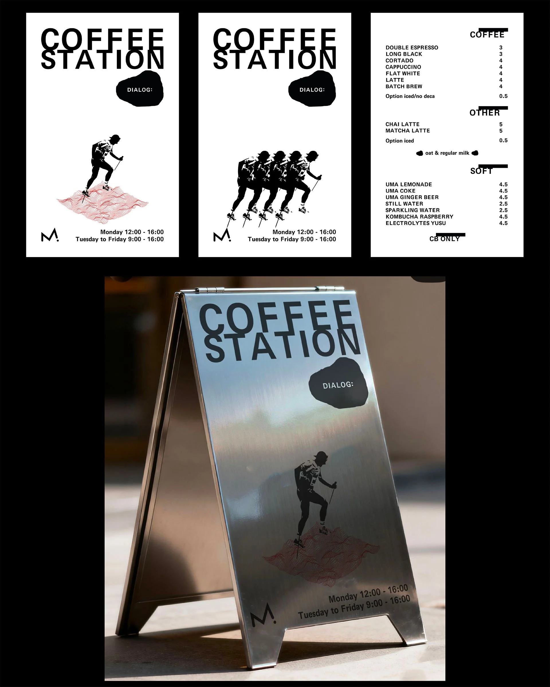
Design of the global visual identity for the Coffee Station, a pop-up space co-branded by Dialog: and Maurten at the 2026 UTMB in Chamonix.
Envisioned as a gathering point for the outdoor community, this project is presented here in its Director's Cut version.
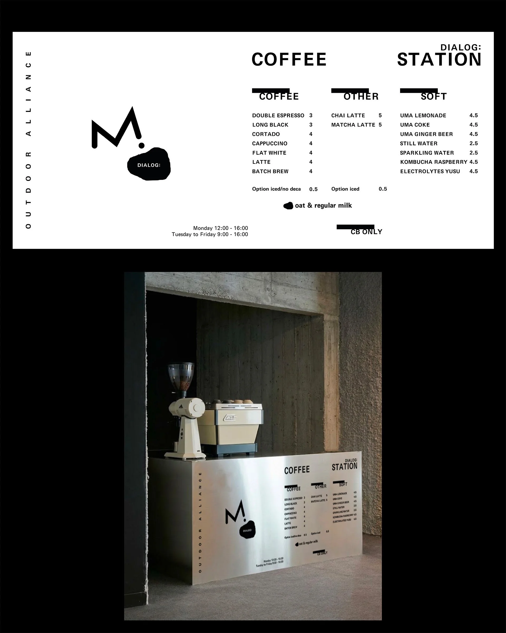
The scope encompasses a complete graphic ecosystem: physical touchpoints (A-frame signs, menu boards, structural branding)
alongside digital deployment (Instagram motion assets).
The approach: a raw art direction and radical minimalism to ensure immediate visual impact in a highly trafficked environment.
Wayfinding & Signage
Two execution proposals for the outdoor A-frame, acting as the first visual touchpoint of the space. 50x80cm print.
The design centers on integrating the runner within the red topographic contour lines - the core visual thread of this project.
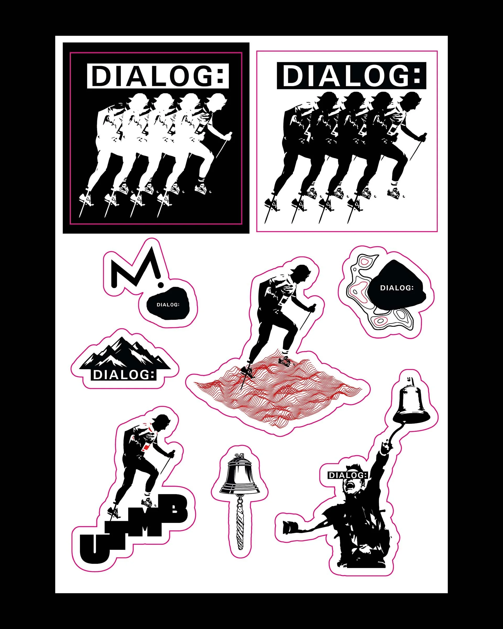
Sticker Pack
Identity rollout on an A5 die-cut sticker sheet. Custom vector illustrations capturing the iconic codes of the race: the finish line bell, the mountain peaks, and the runner in full stride.
Menu Board
The main "Outdoor Alliance" display, designed for a 1.82m x 0.82m landscape print.
A strict exercise in Swiss design and information hierarchy to structure the menu for readability.
Digital & Explorations
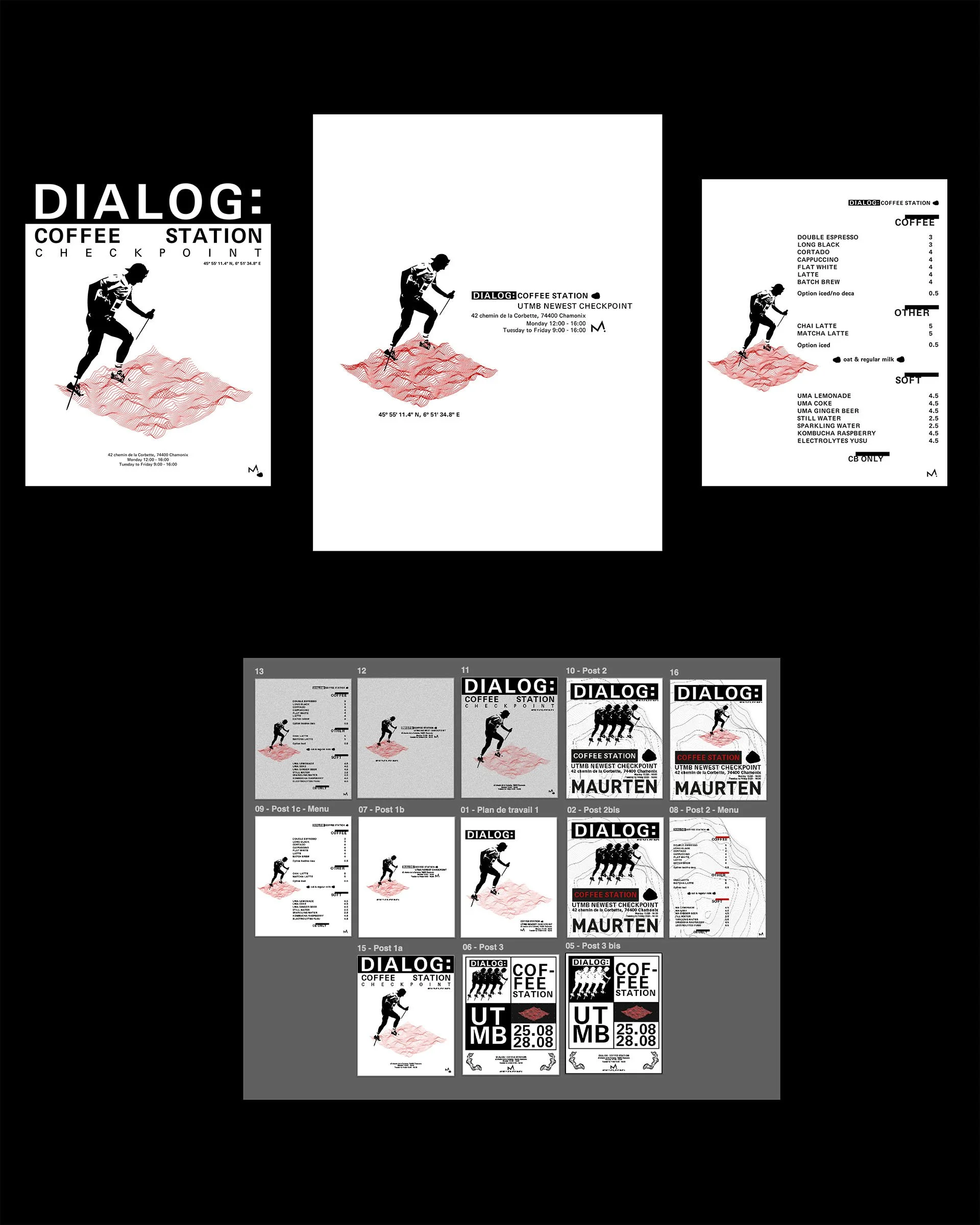
Translating the physical identity into social media assets via Instagram motion designs & carousel mockups, alongside a glimpse into the initial R&D drafts for the Maurten co-branding.